
Image PPT style
Tech Gradient
Tech Gradient wraps infrastructure and AI stories in electric color: green-to-cyan and violet-to-blue washes over dark panels, with charts that feel like live telemetry. It is the style for throughput, clusters, models, and anything measured in transactions per second. Describe your topic, generate the deck, then adjust any figure in the PPT Canvas editor.
What this style looks like
Base panels are dark slate, but headers, dividers, and key numbers carry saturated gradients, typically green into cyan or magenta into violet. Typography is a technical sans with wide uppercase kickers and monospaced-feeling numerals for metrics. Layouts borrow from hardware spec sheets: tight grids of labeled blocks, thin rules, and small-caps annotations. Charts glow against the dark background, with gradient fills on bars and lines. The result reads as infrastructure: precise, energetic, and engineered rather than decorated.
Metric tiles repeat a fixed anatomy from page to page: a small-caps label on top, an oversized monospaced value in the middle, and a thin sparkline or delta underneath. Every block carries its own label, so a page can be read in any order the way a spec sheet is skimmed, and columns snap to consistent gutters no matter how many blocks a page holds.
The gradient system follows rules rather than mood. One gradient family leads a deck, secondary charts use its dimmer end, and status colors stay separate so an alert still reads as an alert. Small-caps labels do the orienting work that color would otherwise handle, which keeps pages legible for colorblind viewers and in grayscale printouts. Energy comes from saturation and precision together, never from clutter.
Best use cases and industries
AI model training readouts
Throughput curves, loss charts, and cluster utilization render like a monitoring view instead of a slide. A training recap in this style speaks fluent MLOps. Put the run id and date in the kicker and every page becomes citable later. A deck assembled from weekly runs still reads as one document because the chart styling never moves.
Compute and capacity planning
Fleet utilization, cost per inference, and procurement scenarios fit the labeled-block grid naturally. Finance and engineering read the same page without translation. Scenarios sit side by side on the grid, so trade-offs compare in a single glance.
Semiconductor and robotics product decks
Spec sheets, benchmarks, and subsystem diagrams take to the technical grid and glowing accents. The aesthetic matches the industry it describes. Benchmarks carry the argument, and the style keeps them looking measured rather than boastful.
Developer conference deep dives
Benchmarks and architecture walkthroughs stay legible on bad projectors because the palette is high contrast by design. Speakers get telemetry-style charts that feel current. Dark, high-contrast pages also photograph well from the audience.
Example slides in this style
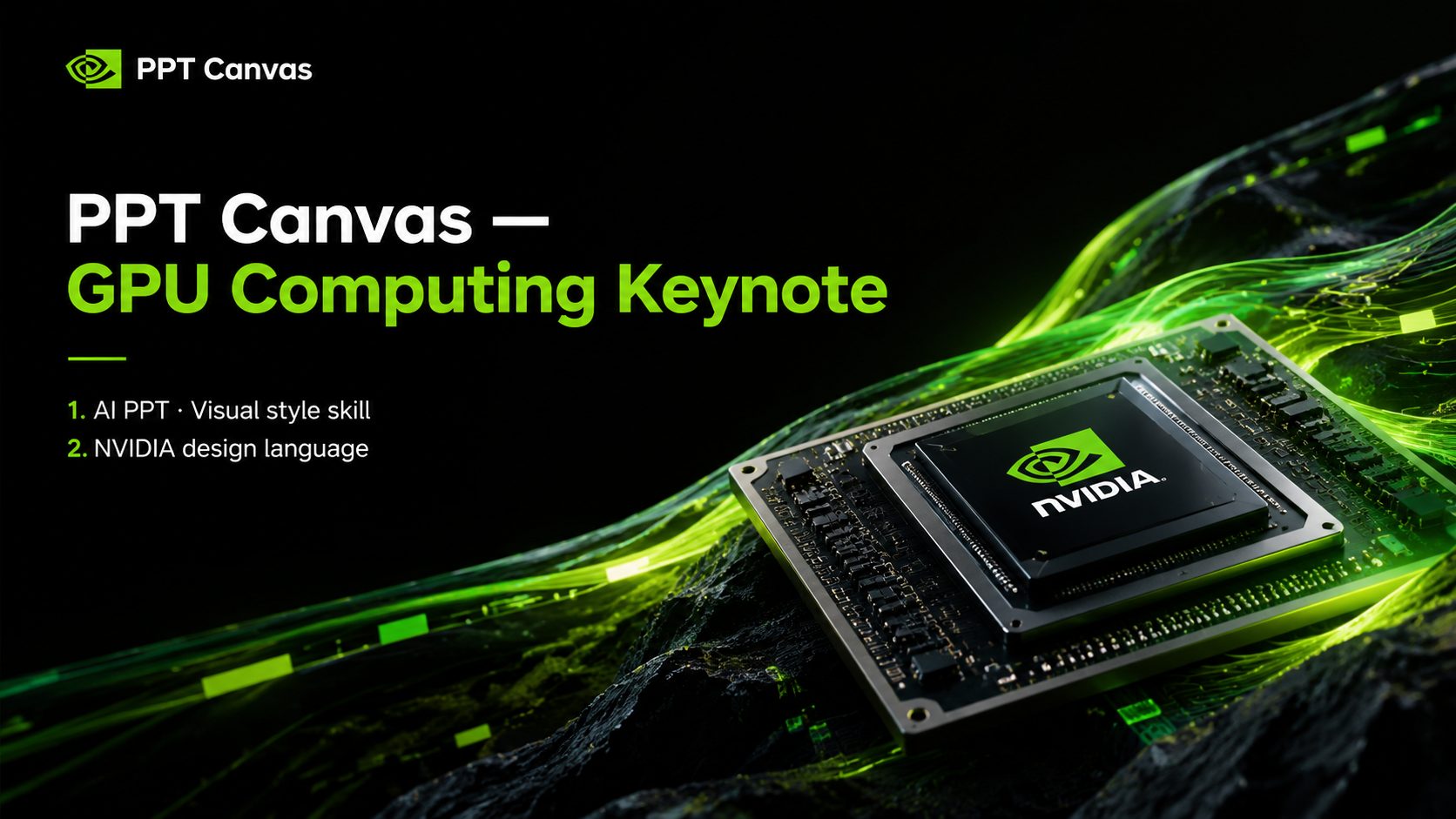
The two examples below were generated from short prompts and show the style on realistic infrastructure content. Bars, labels, and column copy all remain editable on the canvas. Both pages read the way a monitoring dashboard reads: current, precise, and unhurried. Small-caps annotations and thin rules do the labeling on both, so neither page depends on color alone to be understood.
Training run 47
Model Training Throughput by Cluster
Architecture
Full-Stack Platform Layers
Silicon
Custom accelerators handle the training and inference load at the lowest cost per token. Utilization telemetry reports hourly.
Systems
The scheduler packs jobs across clusters with automatic failover. Networking keeps interconnect latency under benchmark.
Services
APIs expose the platform to product teams without exposing the plumbing. Quotas, tracing, and billing are first-class.
When this style is the wrong choice
Gentle healthcare and patient communication: the electric, high-energy palette can feel alarming in contexts that need calm and reassurance.
Luxury and fashion editorial: gradients and spec-sheet grids fight the photography and typography those decks depend on.
Print-heavy legal and policy documents: dark pages and glow effects lose their appeal on paper and add nothing to fine print.
FAQ
- Is Tech Gradient too loud for a corporate audience?
- It is bold, but it is also orderly: the grids, rules, and labels keep the energy from turning into noise. For infrastructure, AI, and hardware topics, most enterprise audiences read the style as current rather than flashy. If your topic is conservative finance or people-centered storytelling, a calmer style will serve you better. Another option is leading with one gradient page and letting the rest stay quieter.
- Can Tech Gradient charts show my real data?
- The generator produces a realistic chart from your topic, and every bar, label, and caption is editable in the PPT Canvas editor. Paste your actual numbers in, and the gradient treatment applies automatically. Keep the kicker as a run label so updated charts stay traceable to their source. The finished charts export to .pptx exactly as styled.
- Do the gradients survive when I export to .pptx?
- Yes. Slides export as fully rendered pages, so the gradient fills, dark panels, and glowing accents appear in PowerPoint the way they look in the editor. Because rendering happens before export, there is no font or effect mismatch to clean up afterward. Nothing depends on native gradient support in PowerPoint either, since the gradients are baked into the rendered slides.