
Image PPT style
Dark Product
Dark Product builds slides on near-black surfaces with crisp white type and a single electric accent, the way modern software ships its own release notes. Roadmaps, launches, and adoption metrics all read sharply against the dark. Generate a deck from your topic, then adjust any panel, chart, or label in the PPT Canvas editor.
What this style looks like
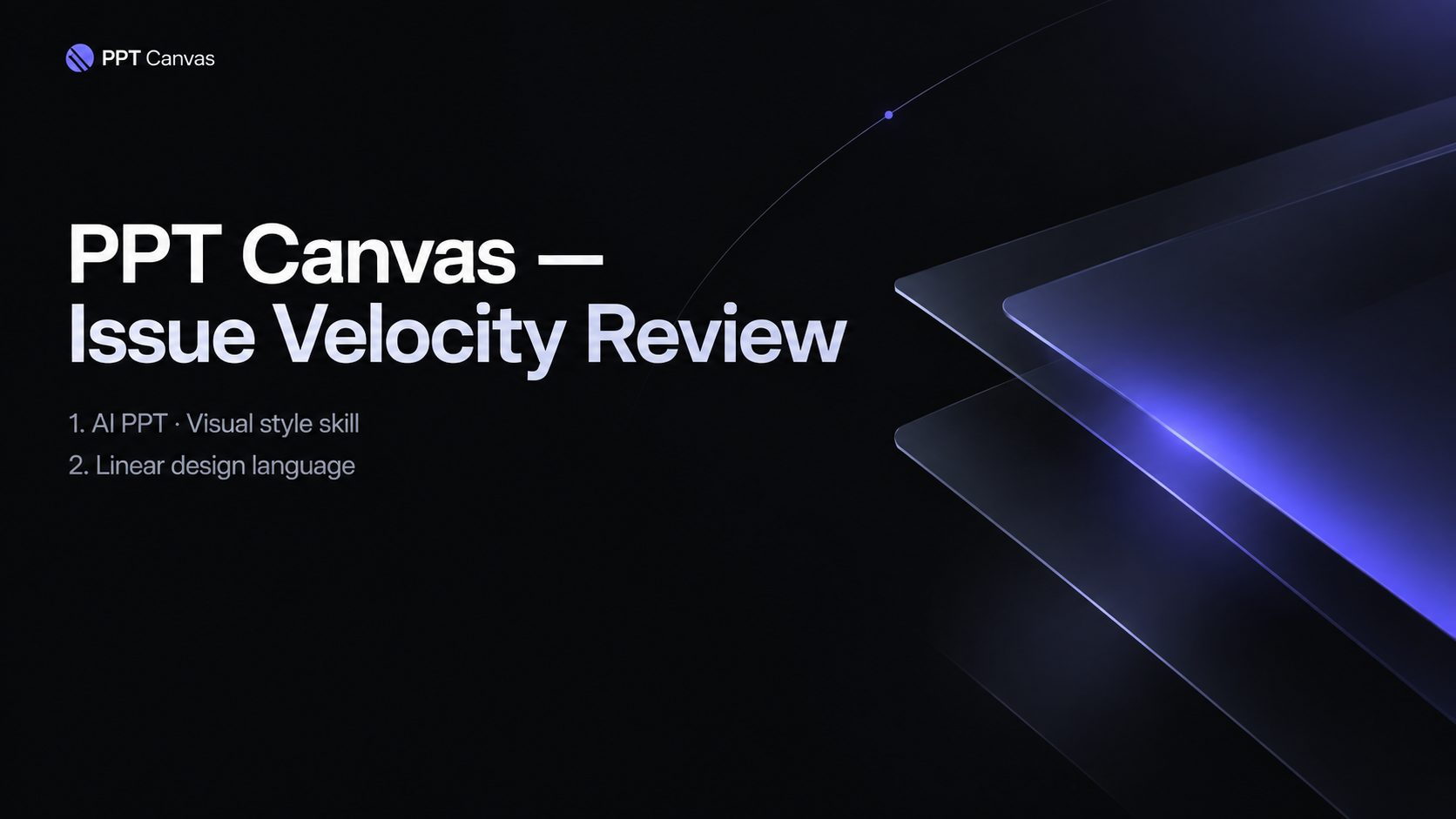
Backgrounds are a deep charcoal near true black, with white primary text and cool gray secondary text; one electric accent, usually violet or cyan, marks highlights and active states. Cards sit a step lighter than the canvas and are separated by hairline borders rather than shadows. Typography is compact and geometric with tight line height, so dense product detail still feels ordered. Layouts use small rounded corners, a subtle glow on key numbers, and spacing that is generous but disciplined. The overall effect is a live product interface frozen into presentation form.
Dark mode here is not an inverted light page; it is composed for dark from the start. Secondary text stays above contrast minimums, charts separate series with light strokes rather than relying on color alone, and panels never depend on shadows that vanish against a dark projector. The pages hold up on a phone in a dim room as well as on a large screen in a meeting.
Accent usage is rationed by page: one glowing element at most, so the highlight still reads as the most important thing on the screen rather than wallpaper. Everything else stays white or cool gray, which is what keeps the dark surfaces from feeling heavy after twenty slides.
Best use cases and industries
Product launch reviews
Feature announcements land like changelog entries, each with a name, a one-line benefit, and a supporting metric. Teams ship the deck the same day the release goes out. Put the version number in the kicker and each page doubles as an archive.
Roadmap and planning sessions
Quarters, themes, and bets organize into timeline panels that stay legible even with heavy detail. The dark surface keeps long sessions from feeling visually loud. Because every panel shares the same border weight, scope changes between quarters are easy to spot.
Growth and analytics readouts
Funnels, cohort charts, and activation numbers glow against the charcoal background, so trends read instantly. A weekly metrics review in this style feels like opening the dashboard. Weekly reviews also move faster when the chart styling never changes between meetings.
SaaS and developer tool pitches
Software buyers recognize the aesthetic from the tools they already use, which builds quiet credibility. Screenshots and UI fragments blend in naturally instead of clashing with the slide. Dark panels also make live demos feel continuous with the deck when you switch to the product.
Example slides in this style
Both examples were generated from a short prompt and show the style applied to realistic product content. Each element, including the funnel bars and column copy, remains editable on the canvas. Notice how secondary information recedes into cool gray without disappearing entirely.
Growth review
Self-Serve Signup Funnel
Release notes
What Shipped This Quarter
Canvas editor
Multi-select, snap guides, and inline text editing arrived this quarter. Most layout fixes now take seconds instead of a support ticket.
Style controls
Accent color and surface depth are adjustable per deck. Teams match brand palettes without leaving the editor.
Export pipeline
Exports to .pptx now preserve fonts and spacing reliably. Large decks export without timing out.
When this style is the wrong choice
Printed leave-behinds and handouts: dark pages drain toner and lose contrast on paper, so any deck meant for printing should stay light.
Bright outdoor or daylight settings: projectors and phone screens in direct sun wash out charcoal surfaces faster than white ones.
Warm lifestyle, wellness, or food topics: the cool, technical mood fights subjects that depend on warmth and appetite appeal.
FAQ
- Are Dark Product slides readable when printed?
- They print, but a dark style is not the best tool for paper: contrast drops and ink use goes up. If a deck must live in both places, generate a second version in a light style or print the exported .pptx in grayscale to test first. For screen-only decks, readability is excellent. Keep a light duplicate only for the few people who insist on paper.
- Can I mix dark and light slides in one deck?
- You can edit any slide on the canvas, but mixing surfaces mid-deck usually looks accidental unless it is a deliberate section break. A cleaner pattern is a dark deck with one inverted closing slide, which the editor makes easy to build. Consistency reads as craft.
- Is Dark Product a good style for a startup pitch?
- It suits software startups whose product already looks like this, because the deck and the demo feel like one system. If your audience is traditional finance, a light, number-led style may land better. Generate both from the same topic and compare before you commit; the comparison takes under a minute.